Designing an AI Fitness Campanion
Reimagining AI coaching for shared gym environments — where the technology stays quiet, the corrections stay private, and the user stays in control.


Behavioral Design
Interaction Design
UX Research
Project Overview
AURA is an AI-integrated gym equipment system that removes the need for screens and loud spoken instruction by embedding adaptive coaching directly into physical machines. Through responsive resistance, localized haptic feedback, and subtle visual signals, AURA gives users quiet, non-intrusive exercise support — positioning gym equipment as a helpful companion rather than a corrective, judging authority.
The Challenge
Connected fitness systems are screen-heavy, correction-driven, and very visible. In a shared gym space, that creates social pressure - users become more self-conscious, not less. Many disable the technology entirely. We identified three barriers no existing product was solving together.
01
02
03
Bright screens dominate the gym floor, breaking focus and flow in a shared environment.
Form corrections appear publicly, leading users to disable feedback rather than be coached in front of strangers.
Users lose autonomy - they don't trust AI systems they can't override, no matter how accurate.
RESEARCH PROCESS
Understanding the problem before designing for it
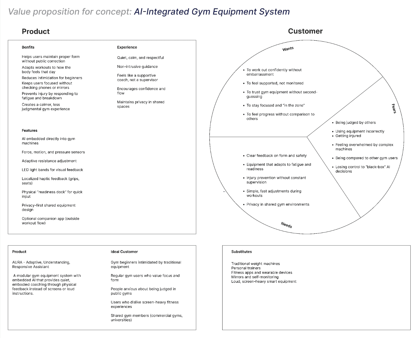
We began with a value proposition canvas mapping the core tension: traditional equipment and screen-heavy smart tech tend to scare, judge, or overwhelm rather than support. AURA's opportunity was discreet, confidence-building guidance that adjusts to a user's form and fatigue.
To test that framing, we ran an anonymous survey and interviews with four participants exploring guidance, comfort, and trust in automation.
"I don't mind the machine helping — I just want to be
the one who decides when."
Synthesized using an AEIOU framework, three patterns emerged:

Internal doubt > judgment
Users fear their own mistakes more than being watched
Control is non-negotiable
Automation welcome only if it can be overridden
Quiet feedback wins
Lights and haptics trusted over audio or screens
— Interview participant
user perspective
Meet the three users
Three personas, each built from a full empathy map, represent the range of people AURA needs to support - different ages, fitness levels, and comfort levels in gym environments.
M
Maya
24, Beginner
Self-conscious. Her fear isn't being judged by strangers — it's judging herself. She wants to know she's doing things right without broadcasting that she's still learning.
NEEDS
Private form guidance
Reassurance, not correction
No public mistakes
D
Daniel
32, Experienced
Mood-driven. Performance shifts day to day. He doesn't want constant feedback — he wants a system that knows when to stay quiet and out of the way.
NEEDS
Adaptive intervention
Skippable feedback
Trust in his own judgment
M
Meera
29, Intermediate
Building confidence, learning by doing. She gains confidence when feedback is clear and loses it when feedback feels like criticism.
NEEDS
Encouraging tone
Progress visibility
Non-comparative feedback
"We thought users feared being judged by other people. What we learned is they mostly feared judging themselves."
Design Direction
Based on our research, we established three principles that guided every design decision — from how alerts surface, to how progress is displayed, to who gets to see what.
01
Private by default.
02
Optional by design.
03
Overrideable at any point.
Rapid ideation
Crazy 8 sketches, across all four features
Before committing to a layout, each feature owner rapidly explored eight rough directions for their core screen — testing how to present real-time feedback, alerts, and progress without overwhelming the user.

Bringing it to life
Storyboards, across all four features
Each feature owner storyboarded their concept in a real gym scenario before any screens were drawn - grounding the interaction in a moment, not just a flow.

Testing and iteration
Validating the concept before committing to it
Before high-fidelity design, we ran a low-fidelity usability test with three participants — one matching Maya, one general, and one matching Daniel — using a think-aloud, Wizard-of-Oz method.


Scan setup, live tracking, and summary understood without guidance
What worked
The consistency screen failed independently for all three participants. None could tell what triggered it or what it measured.
What didn't
Redesigned post-warning flow and consistency-feedback screen, Added a title and explanation, added session-history trends for advanced users, clarified friends-screen interactivity.
What changed
FInal experience
The Four Features
Intelligent Scan
The camera scans posture in real time and shows a live body map of which joints are tracking well. Consent is asked every session. Corrections appear as private, dismissible cards - never broadcast to the room. A quiet haptic pulse confirms improvement.
— Consent re-asked at the start of every session
— Form corrections as private, dismissible cards
— Haptic confirmation replaces on-screen celebration
Adaptive Progress
Instead of a single score, AURA measures energy, strength, and consistency together. It detects fatigue spikes and recovery patterns, then offers one simple, actionable tweak for the next session. The consistency calendar is private - never a leaderboard.
— Three dimensions tracked: energy, strength, consistency
— One actionable tweak per session, never overwhelming
— Calendar visible only to the user — no public streaks
Adaptive Motivation
A social layer built around support, not competition. Friends can see your streak, not your weights. One-tap encouragement carries no metrics attached. Milestone celebrations are private by default - you share them only if you choose to.
— Streaks shared, performance numbers hidden
— One-tap encouragement with no metrics attached
— Opt-in milestone sharing keeps users in control
Intelligent Coaching
The system monitors form and strain across sets, intervening only when something crosses a real risk threshold. Alerts route directly to the wearable - Apple Watch, Garmin, Fitbit, keeping coaching private to the user. A 15-second check-in always gives the user the first response.
— Wearable-first alerts, never visible to others
— Risk-based intervention threshold prevents over-coaching
— 15-second window gives users control before the system acts
Visual System
A consistent design system — dark theme, acid-lime accent, defined color palette, typography scale, and reusable components - was established before high-fidelity screen production began, letting two designers work in parallel without visual drift.
Near Black
#OBOD12
Neon Lime
#C6F135
Teal
#OO4E57
Charcoal
#262A2A
What We Learned
Every project teaches something. These three insights genuinely reshaped AURA mid-process and now define how we think about AI in personal contexts.
Fear was internal
Users feared judging themselves more than being judged by others. That shifted every feedback message from corrective to reassuring.
Control beats intelligence
Users wanted more agency over AI, not smarter AI. Every adaptive feature now has an explicit skip path.
Less is the design
The strongest decisions removed words, labels, and notifications. Stillness beats noise — that became a core principle.
Reflection
Designing AURA pushed me to think about AI as a UX layer rather than a feature. The hardest decisions weren't about what the system could do — they were about what it should refrain from doing. How does the user know the AI is watching? How do they trust it? How do you fail gracefully when the scan can't read the user's posture?
My early hi-fi drafts had four accent colors and animated overlays. The final UI uses two colors and almost no motion. The closer I got to the user's reality — sweating, focused, mid-set — the simpler everything became.
This project reinforced that good AI design is restraint design. The hard work isn't in adding intelligence. It's in deciding when intelligence should stay quiet.
Gyms got smart. AURA wants them to get human.